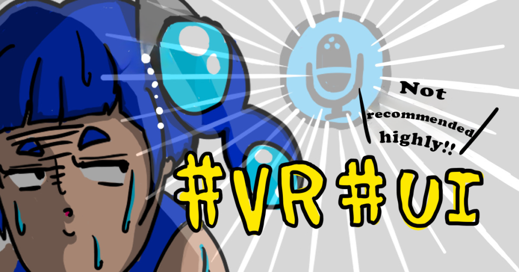
Hello everyone, I am back with another content related to VR (Virtual Reality).
Virtual reality has been gaining a lot of popularity lately. Are you also into it?
As for me, I don’t have much experience with VR, but I often dream about wild virtual experiences like this.
- Once, I found myself engaged in a fierce dodgeball match with ladies in wide dresses, enduring their insults. Surprisingly we reconciled in a hot spring pool afterward.
- Another time, I thought I summoned my ex in the bath, but instead, an ancient noble appeared and apologized while reciting a poem.
I’m confident in my ability to transition smoothly into the Matrix era whenever it arrives, thanks to my wild virtual dreams.
However, since actual VR content is still in its early stages of development, it seems that User interfaces (UI) have not yet fully matured, and operations are often difficult.
Therefore! I decided to contribute to the development of the VR industry by sharing some of the slightly inconvenient UIs that we actually experienced in VR content. I spoke to the engineer within our company who has the highest affinity with VR.
Chat with Engineer Matsumura
- VR experiences about 8 years
- VRChat feels like home
- Creating assets that might be useful in various VR applications
- Owns VR glasses
- Found amazing worlds in VRChat and sometimes falls asleep wearing the headset
- Room is optimized for VR use
I couldn’t imagine what a VR-optimized room would look like, so I asked for an actual photo.
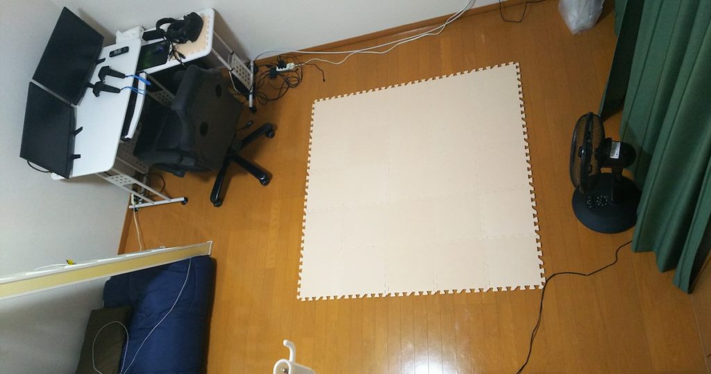

There’s no furnitures at all. What about the TV? Sofa?

TV and sofa are not necessary to play VR. What’s more important is having a space.

Oh, but there’s a mat! In a space where you can’t place items, the best solution for a minimal relaxation area is indeed a mat.
No, I have placed a mat so that I can feel the area with my feet and won’t hit the wall with my hands. I don’t relax on it.

I’m sure you’ll be happy to use it for different purposes rather than relaxing!
According to him, even more advanced users hang the cords from their VR goggles from the ceiling. There seems to be more than this.
Anyway, let me quickly introduce some UI designs that I’ve encountered and don’t really recommend.
7 UIs’ that are difficult to use
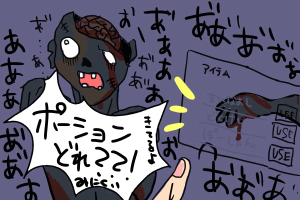
1. Overlapping with objects
It often happens, especially near walls, where UI elements overlaps with objects (virtual items).

You could just display the UI in a wide area, but it’s a bit of a hassle to have one. Are there any solutions for this?
One way to deal with this is to make the UI to appear in the forefront, adjust its position to avoid overlapping with objects, and then fix it so that it doesn’t move when you move your head.
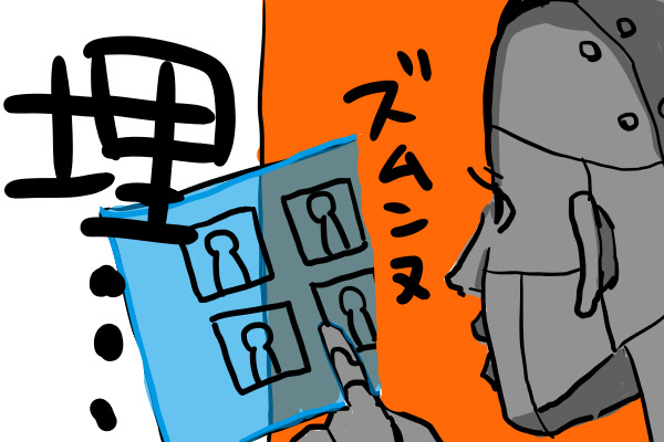
2. Deep hierarchical menus
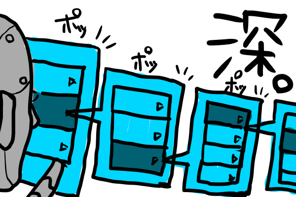
The UI hierarchy often becomes deep and fill the screen. I’ve seen up to three layers deep. When the pointer moves away from the previously selected item, it’s troublesome to reopen it. It would be nice if they implemented to prevent deselection.
It can be definitely annoying when everything closes instantly when you move the pointer away from the UI!
3. UI that doesn’t close
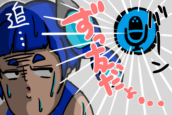
Another issue is when UI elements follow you around. For example, health bar are often located at the top in 2D, but if you directly transfer this to VR, it can end up looking weird.
It’s like the annoyance of a fly in the real world, isn’t it?
Fly… that might be close. Having something continuously in your view can be surprisingly stressful. It would be great to have an option to hide it for users who don’t like it.
4. UI elements blending with background
It’s quite challenging when the UI blends in with the background and becomes invisible. In such cases, you have to open the UI while looking at a different colored background.
Wouldn’t it be better to put a non-transparent background under the text?
Actually, that’s not quite the case. In VR, there are many games where you can’t pause. In such games, if you take too long to select items during battle, you’ll get killed. So, you need to open the UI while watching the enemy. That’s why transparency or just text is often used.

I see, is placing a non-transparent background to enhance text visibility a useless UI then?
It’s like having a newspaper suddenly placed right in front of your face in the real world. It’s intrusive and obstructive.
5. Large 2D UIs: Difficulty reading the corners
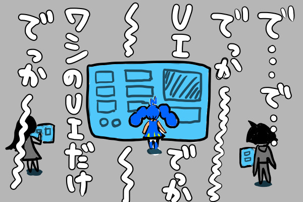
I remembered one more thing. Sometimes, 2D UI elements follow your view and completely fill your field of vision. You can’t see anything else, not even the corners.
UI optimized for insects or herbivores!
Currently, VR headsets such as the HTC Vive, the Meta Quest or the Valve Index typically have a field of view of around 100 degrees, so we don’t really need a field of view as wide as herbivores. However, at the moment, we can only see the things from the side.
It was too early for humans.
6. Small interactive elements
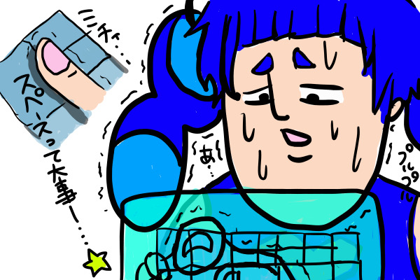
UIs without space between buttons can be quite challenging to use. It’s like the flick input screens on smartphones where the buttons are right next to each other.
Oh, if the buttons are small, there is a high probability of pressing the wrong one. Detailed tasks still don’t seem suitable for VR.
7. A lot of texts
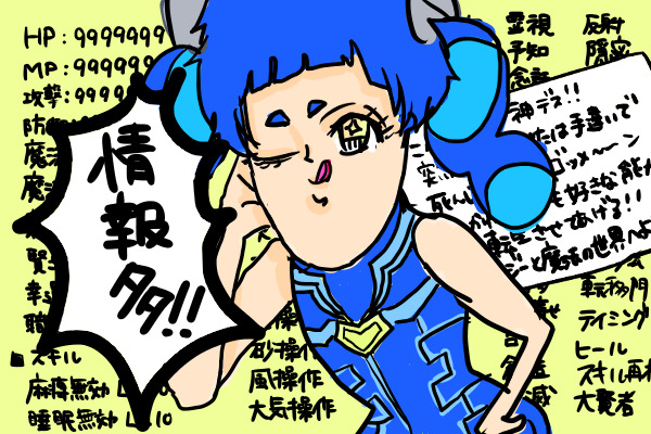
Having too much text can also be quite challenging. This often happens with world descriptions or game explanations. I’m not sure why, but there are many things that just don’t feel engaging to read.
In the real world, print media is considered easy to read, but I wonder how it is in VR. I thought it would be similar, so this is surprising.
Maybe it’s because the resolution isn’t enough. That’s why the text tends to be larger. When the text is large, there are also more line breaks, so you have to move your head around while reading, which could be one of the reasons for it being difficult to read.
I can imagine straining my neck trying to read fast.
Wrap-up
Have you ever experienced any of these common VR quirks?
As mentioned earlier, the UI issues in VR are still not fully resolved. However, I believe that it will continue to be improved through the trial and error by various people in the future. Let’s continue to pay attention to further developments.
We have been sharing more interesting topics on our social media channels. Stay connected with us on Twitter (X), Facebook, Website, Youtube, and Linkedin.
▼ NEXT-SYSTEM Website